
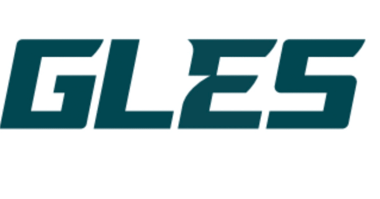
Everybody is Fired Up About the New Eagles Wordmark
What do you do when you’re bored on a June Thursday and we’re between OTAs and Training Camp? If you’re the Eagles, you introduce a new “Wordmark.”
E – A -G – L – E – 5! Still better than how Chris Martin spelled it:
Thoughts on the Eagles new rebranding? pic.twitter.com/UCDk958u51
— Crossing Broad (@CrossingBroad) June 16, 2022
Eagles are implementing a new refreshed watermark! pic.twitter.com/XbUZguucRU
— Crossing Broad (@CrossingBroad) June 16, 2022
Just a quick straw poll using the comments from these tweets I shared, it seems that the majority of people don’t like it. Which I chalk up to “people don’t like change.” Think about it. What’s so bad about it? Genuinely curious. Everyone bitches about new branding, but never say why they hate it. I don’t love the EAGLE5 look and it does look a little Jets-y, but its more modern. People are talking about the logo like it’s a Tinder match like this guy:
Clean. But lacks any personality. Feels like it should belong to the Jets.
— Joseph Marrella (@JMarrella) June 16, 2022
No personality? What’re you trying to decide, if you should bring the logo home to meet your parents or something? Are you buying dinner for the logo hoping it’s down to fuck? What are we doing here?
The #Eagles have tweaked the wordmark for their logo, going with a more modern look. pic.twitter.com/raqORA9dvm
— Ari Meirov (@MySportsUpdate) June 16, 2022