
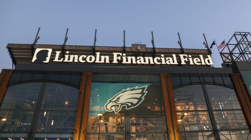
Eagles Install New Signage, Sort of, at Lincoln Financial Field
If you’ve driven by the Linc recently, you may have noticed a slight update. The Lincoln Financial logo and wordmark has been updated:
![]()
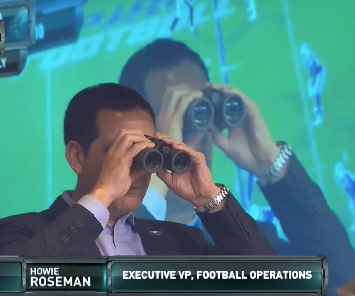
The multiple Lombardi Trophies is a nice touch as well, but in this picture, which comes from a recent Eagles video, you can see Abe Lincoln’s full face on the left. The old signage featured a profile-oriented silhouette of Honest Abe.
It kind of flew under the radar, but Lincoln Financial announced the change in September, saying this via press release:
“Lincoln Financial (NYSE: LNC) today shared that it is refreshing its brand with the objectives of sharpening the visual representation of the company’s purpose and honoring its storied heritage, while marking its next chapter. The enhanced brand visuals and messaging bring together Lincoln Financial’s deep connection to the values of its namesake, Abraham Lincoln — honesty, trust and integrity — while emphasizing its ongoing commitment to its customers’ financial futures.
“Our refreshed brand is a clear reflection of our purpose — providing financial protection and security to our customers and their families — and an expression of our core organizational values,” said Ellen Cooper, Chairman, President and CEO, Lincoln Financial. “We’re incredibly proud of our deep history, and we are looking toward the future with a steadfast focus on stewardship — this is our long-term commitment to deliver on the financial promises to the customers we serve today and tomorrow with care, offering solutions to address individual needs with a clear impact on what matters most.”
They added a new tagline as well, which is “Your tomorrow. Our priority.” That’s not reflected at the stadium, which is only getting the new signage now, even though the branding update took place a few games into the 2024 season. This is what the new logo looks like in digital form, compared to the old logo:

![]()
Rhetorical question: does this stuff actually matter? Not trying to be dickhead, honestly curious. I am a satisfied Lincoln Financial account holder and not once have I ever given thought to how Abraham Lincoln’s mug is depicted. Brand “refreshment” feels like something that only C-suite executives and consultants care about. Personal experience: New York Management at CBS used to force this upon Eyewitness News all the time. “We should make the anchor desk curved instead of ovular! What about triangle mic flags instead of square? Should the talent rain jackets have buttons or zippers?” It was always weird. The grunts were out there busting their butts, trying to gather news and put a decent product on television while the corporate big wigs were sitting there talking about what color the female anchors’ wrap dresses should be. No offense to C-suite executives, but slight offense directed at consultants.
h/t to reader Adam for sending this over